
Reports
The Reports module in Reqtest allows you, as a test lead, project manager, or PMO, to gain actionable insights through different types of reports based on data in Reqtest. In the Reports module, you can:
-
Create reports using data from a single module or across multiple modules
-
Organize reports into dashboards and share them with your team members
-
Export reports to a suitable format for use in your presentations
Videos on the Reporting Module
Key Features
You can create reports based on all data from the requirements, test, and bug report modules. If you have linked your items, you can generate reports that give you full traceability. For example, if you have linked your requirements to your test cases, you can create a report showing the number of bug reports associated with the requirements you aim to complete in the upcoming sprint.
Before You Start
The Reports module uses all data from the other modules. To create relevant reports, it is important that you have both the fields you need in each module and that you work on linking the items together. If you do this, you will have the ability to create a wide range of reports.
Create a Report
You can create a report based on a single module (requirements, test cases, or bug reports) or using data from a combination of modules. To create a report, navigate to the User Reports tab in the Reports module and click the + icon in the top right corner of the page.
You can also create reports directly from the different modules in Reqtest by clicking Create Report from the kebab menu within each module.
All reports you create will be listed under the Reports tab in the Reports module.
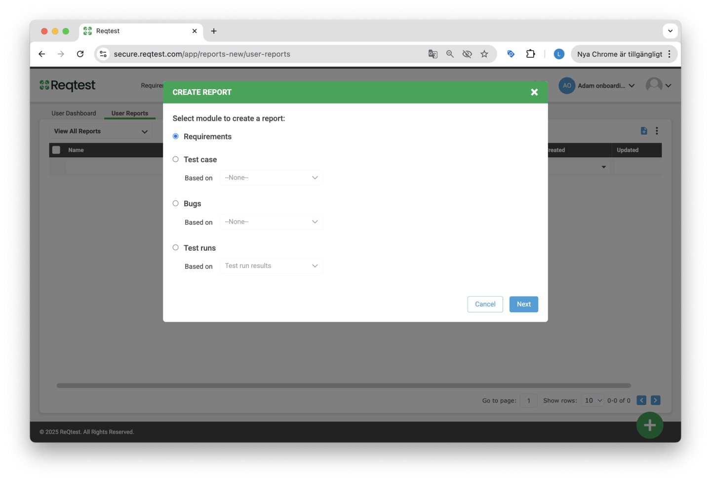
Single Module Report
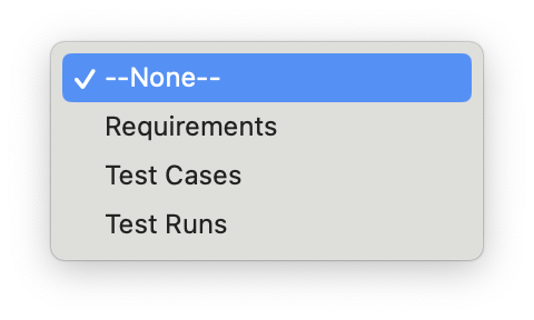
A single module report reflects data from the selected module. You can create a single module report for requirements, test cases, and bug reports. Click on the module you want to base your report on, select None in the Based on dropdown menu, and then click Next.
In the next step, you can choose whether you want to base your report on a specific view. Read more about list views here.
Cross-Module Report
A cross-module report shows the relationship between two different modules. To create a cross-module report, there must be links between the different items in Reqtest, meaning a requirement must be linked to a test case, which in turn is linked to a test run, and so on.
Create a cross-module report by selecting one of the options under the Based on dropdown menu. For example, if you want to create a report showing bugs linked to requirements, you can select the option Bugs based on Requirements.
Data View
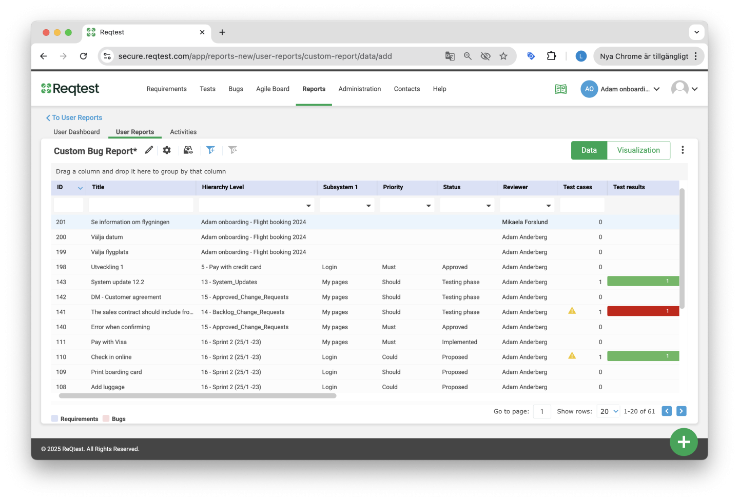
Once you have created a new report, you will be redirected to the Data View, where you can start working with the data in your report. The Data View is similar to the view used for creating custom views in the requirements, test, and bug modules.
Here you can:
-
Filter data in the table by adding or removing filters based on your needs.
-
Add and remove columns from the table using the Show/Hide Columns function in the settings.
-
Create a new view via the Save View As option in the settings menu; this view will automatically appear in the list of views for the relevant module.
If you have created a cross-module report, the functions in the Data View are the same as for a single module report, with the following exceptions:
-
The Save View As option will not be available.
-
An additional Advanced Filters feature will allow you to further filter data from the table.
Quick Tip!
It is possible to export the Data View to Excel by clicking the kebab menu and selecting Export.
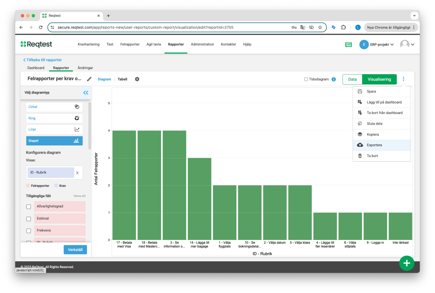
Visualization View
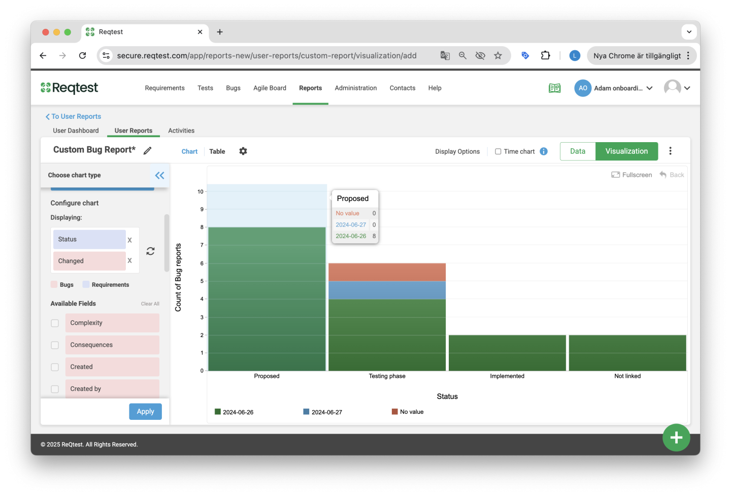
Once you have selected the specific dataset you want to use in your report, you can go to the Visualization View. There, you can choose the chart type to present your data and make additional settings to customize the report to your needs.
You can switch between the Visualization View and the Data View at any time. If you want to apply additional filters to your report data, switch to the Data View, apply the necessary filters, and then switch back to the Visualization View.
Edit Data and Design
Reqtest allows you to edit your reports in several ways, and all edits are made in the Visualization View.
Among other things, you can:
-
Select data
-
Choose chart type
-
Configure charts
-
Customize chart colors
-
Create time-based charts
Quick Tip!
You can make better use of the space in the Visualization View by collapsing the “Choose Chart Type” toolbar on the left. This gives you more room to work with the chart itself.
Configure Chart Data
To select and configure the data you want to include in your chart, choose one or two options from the Choose Chart Type toolbar on the left.
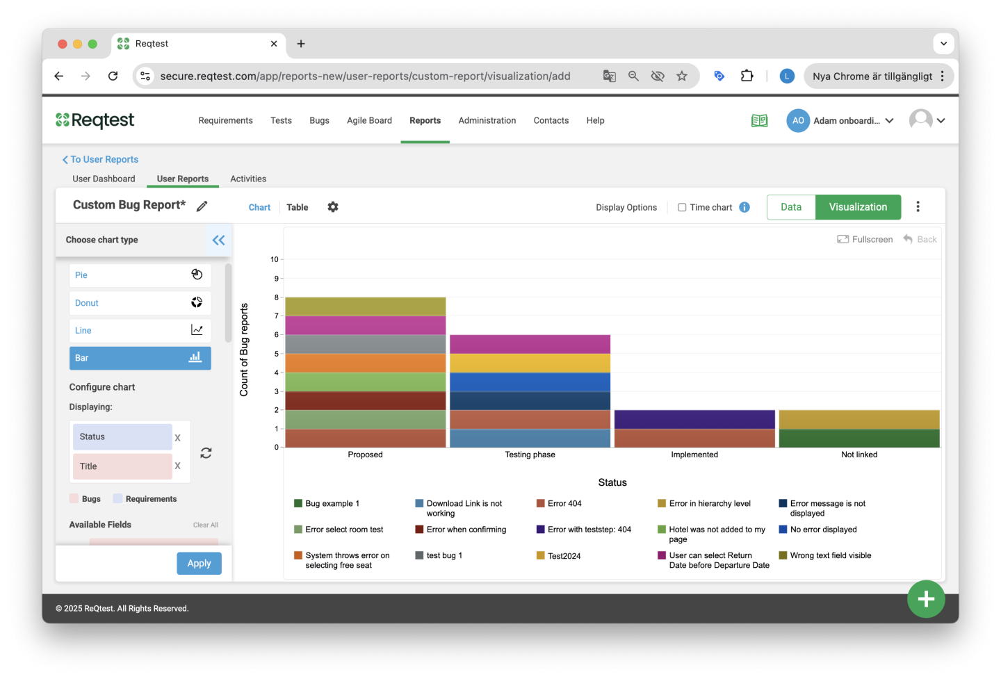
Once you have selected the data, click Apply and the Visualization View will populate with the chart.
Quick Tip!
If you do not want the Reqtest-generated ID to be visible in your report, select the field Title. Similarly, if you select the field ID – Title, the Reqtest-generated ID will be visible in the report.
Choose Chart Type
In Reqtest, you can choose from six different chart types:
-
Pie Chart – Displays data in a circular chart where each segment represents the relative size of the dataset.
-
Donut Chart – A variation of the pie chart.
-
Line Chart – Shows information that changes over time.
-
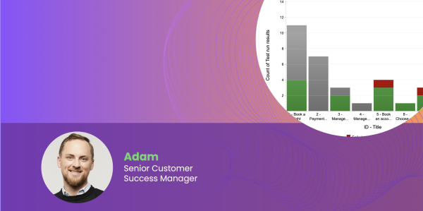
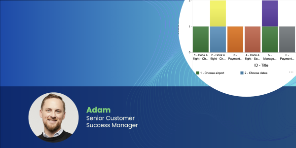
Bar Chart – Displays vertical or horizontal rectangular bars where the length of the bars is proportional to the value of the dataset.
-
Area Chart – Displays value ranges stacked on top of each other and fills the area between the line and the horizontal axis.
-
Time Chart – Shows how your data changes over time. A time chart displays the time dimension on the X-axis (horizontal axis) and the measurement scale on the Y-axis (vertical axis). Read more about time charts here.
Quick Tip!
Switch between the chart and the underlying data table by clicking on Chart vs Table in the upper left corner of the Visualization View (next to the chart’s name).
Customize Reports
Once you have filtered your data, selected which fields to include in the chart, and chosen a chart type, you can start customizing your report. To customize your report, click the Settings icon at the top of the Visualization View.
You can make the following changes:
- Customize X- and Y-Axis
- Customize Chart Colors
- Customize Time Charts
Customize X- and Y-Axis
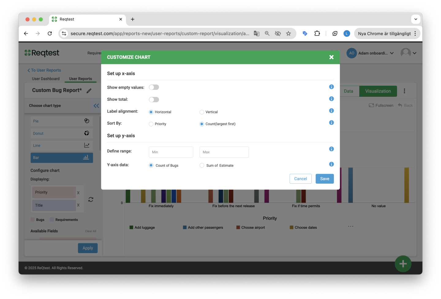
Customizing the chart includes the following settings:
-
Show Empty Values – You can choose to include empty values in the chart. The default setting is to always show empty values.
-
Show Sum – Displays the total for each column in the chart and applies to all chart types.
-
Text Orientation – Choose to rotate the labels on the X-axis either horizontally or vertically.
-
Sort By – Choose the sorting order for the fields shown in the charts, either alphabetically or by showing the highest value first.
-
Define Limits – You can set the range for the Y-axis by specifying a minimum and maximum value to display bars/lines for each category within the defined range.
-
Y-Axis Data – Choose whether you want to display count or sum on the Y-axis. The default setting is to display count, but you have the option to display the sum for any numeric field. This can, for example, be used to show the total estimated effort for fixing open bug reports.
-
Specific Settings for Time Charts – Read more here.
Customize Chart Colors
It is possible to customize chart colors in Reqtest. Color customization is only available for dropdown fields. To customize chart colors, click the Settings icon and select Customize Chart Colors, where you will see which field corresponds to which default color. Charts in Reqtest are created with eight standard colors.
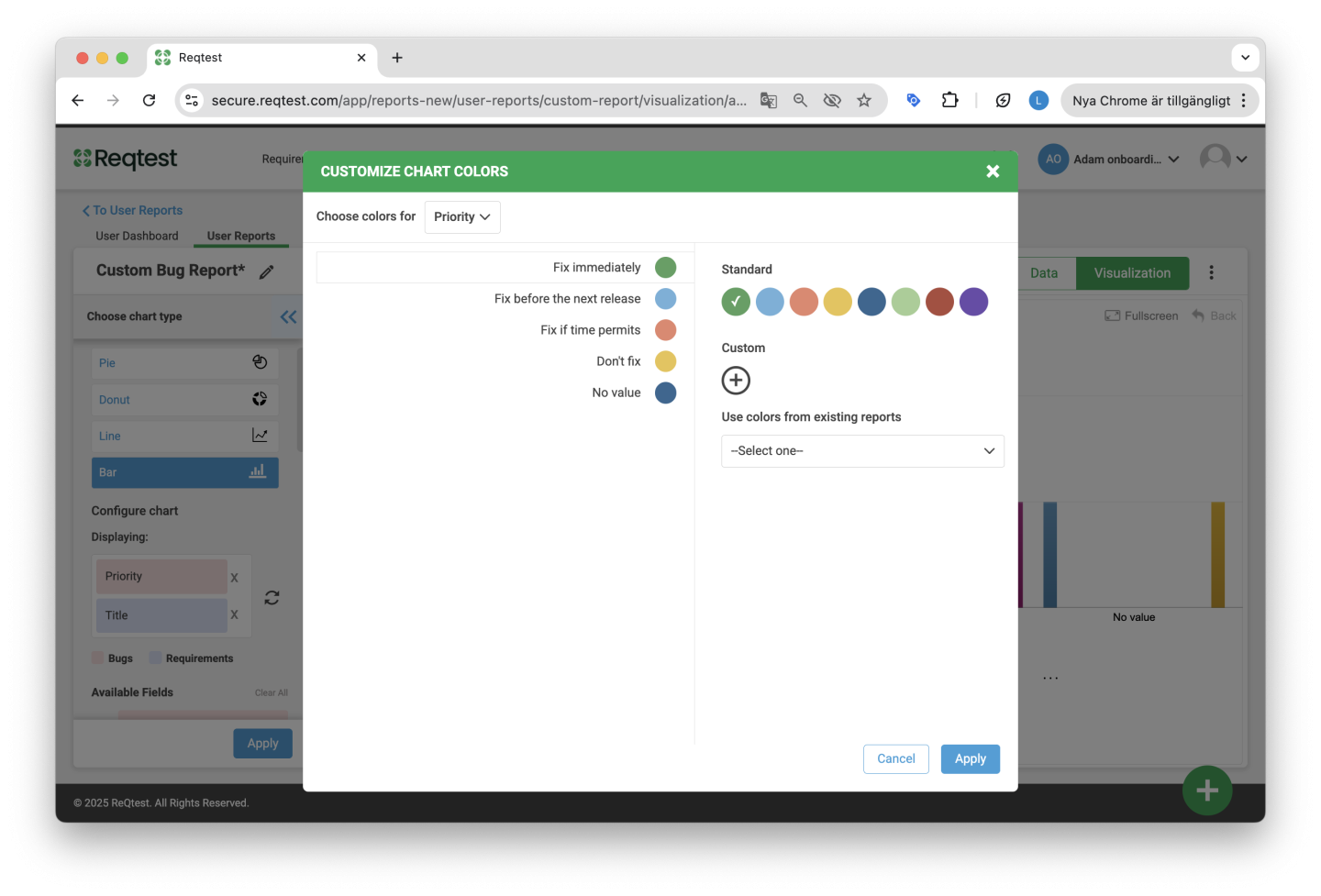
To change the color of a field, simply click on the specific field on the left side of the window and change the color to either a standard color or select a custom color. To choose a custom color, click the + icon and either select a color or enter the color code, then click Apply.
Quick Tip!
Customize your reports in Reqtest to match your organization by adding colors that align with your unique visual identity.
Once you have created a report with your customized colors, you can reuse the colors for other reports by selecting the template report from the dropdown menu Use colors from existing report.
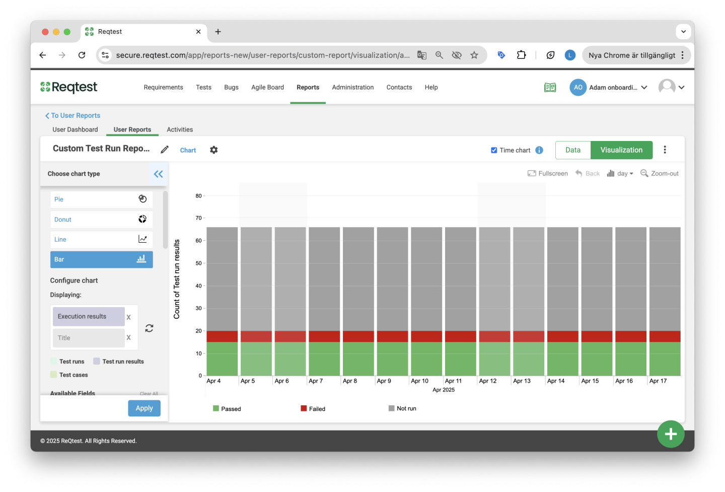
Time Chart
A time chart shows how your data has changed over a defined period of time. A time chart displays the time dimension on the X-axis (horizontal axis) and the measurement scale on the Y-axis (vertical axis). Use bar and line charts when creating time charts.
Specific Settings for Time Charts
When creating a time chart, additional customization options are available. These include:
-
Set Time Range – You can choose between a predefined time period or select your own start and end dates.
-
Current vs Historical Values – Choose whether you want to view your data based on today’s value or based on historical values.
Current vs Historical Values
Choose to display the dataset as current value or historical value.
-
Current value is the value that the dataset holds today.
-
Historical value shows what the dataset’s value was each day since it was created.
For example, if you change the status of a bug report to “Closed,” the current value of the bug report will be “Closed.” However, the bug report will also have historical values for each day it was open. The day the bug report was created, its status was “New.” A few days later it may have changed to “In Progress,” and later to “Closed.”
Using Historical Values
If you want to create a report showing the number of open bug reports over the past two months, you would create a report that includes bug reports with the status “Open.” When you add the Time Chart option and then enable historical values for the Status field, the chart will display a timeline showing how many bug reports were open on each day during the selected period.
Using Current Values
If you want to create a report showing all open bug reports you intend to resolve in your current sprint, you would create a report that includes bug reports with the status “Open” and filter by the relevant sprint. Since bug reports that are currently “Open” may have been reported in earlier sprints and later moved into the current sprint, you would not want these changes to affect your chart for a specific sprint. In this case, you would use current values in the time chart settings.
Share and Manage Reports
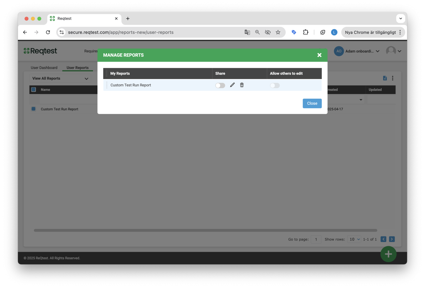
You can share your reports with other members of your projects and allow shared reports to be edited by others. To manage your reports, click the Settings button next to the dropdown menu under the Reports tab in the Reports module and select Manage Reports.
Here you can:
-
See which reports are visible to you
-
Share reports with others
-
Allow others to edit your shared reports
When you allow others to edit your shared reports, they can change the report name, duplicate the report, add the report to a dashboard, and remove the report from a dashboard.
Email notifications are sent to the owner of a shared report if it is edited.
Interact with a Report
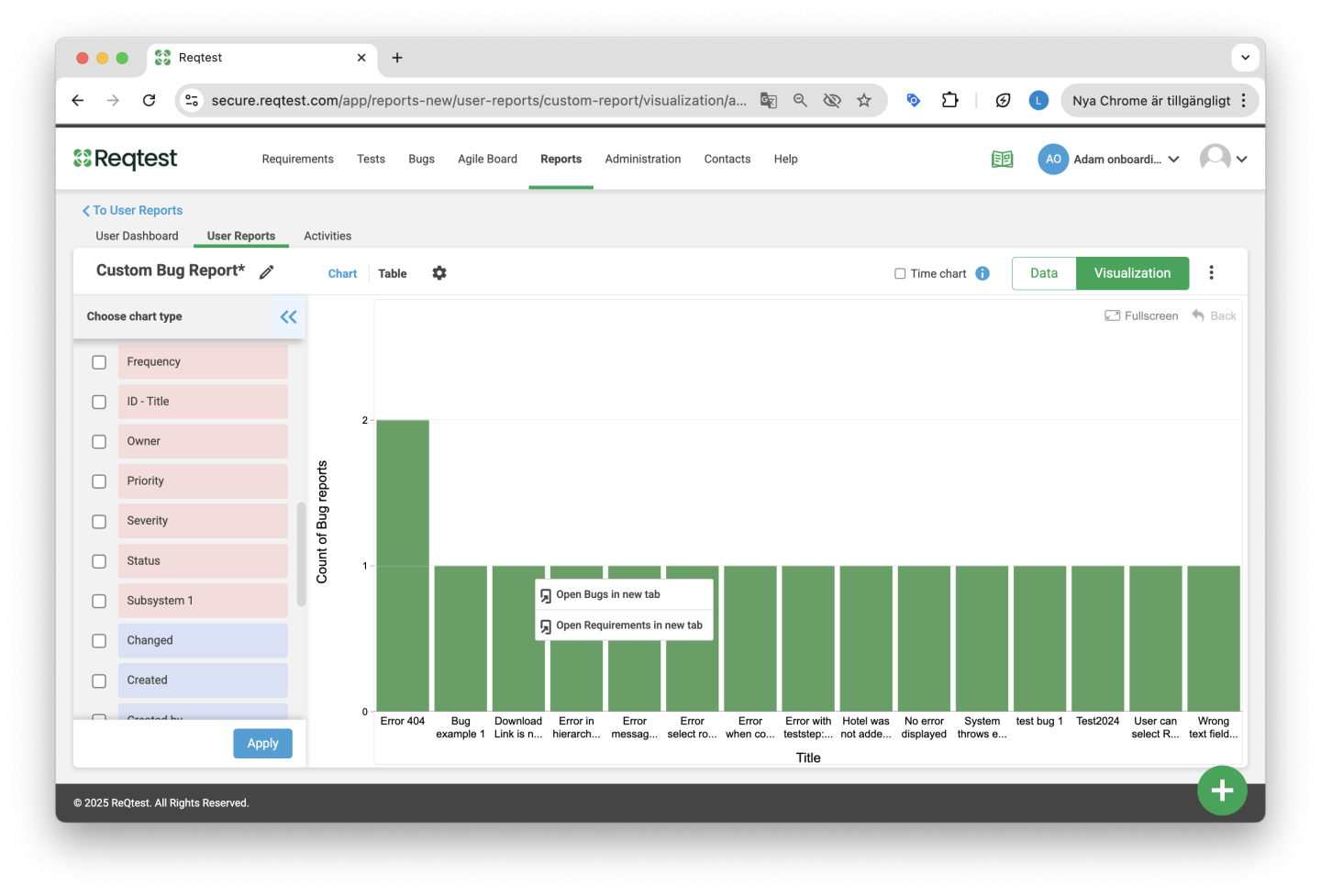
Once you have created your report and added it to a dashboard, you can easily navigate from the specific report to the corresponding module and dataset.
For example, if you have created a report based on a specific requirement status and want to see the underlying requirements, hover over the specific bar, right-click, and select Open Requirements in a New Tab. You will then be redirected to the Requirements module showing the specific requirements from the report.
Note: This functionality is not available for time charts.
Export Reports
You can export a chart in various formats such as PDF, JPEG, PNG, and XLS. Click the kebab menu when you are inside a report, or directly from the dashboard, to export the data.
Activity Log
The third tab in the Reports module is the Activity Log. This feature is shared across all modules, and here you can see a log of what has been changed, when it was changed, and by whom.
Create Dashboards
In the Reports module in Reqtest, you can create customized dashboards. A dashboard can be filled with several different reports, and you can create different dashboards for different purposes. For example, as a test lead, you can create a dashboard for the project team to track testing and bug management progress. As a project manager, you can create a dashboard to present project status to a steering committee.
Create Dashboards
Create a dashboard by clicking the + icon in the top right corner of the dashboards tab in the Reports module. Choose a name for your dashboard and select whether you want to create a private or shared dashboard, then click Create.
Quick Tip!
It is possible to change the settings for your dashboard later on. For example, you can share a private dashboard or allow others to make changes to a shared dashboard. This is done by clicking the Settings icon and selecting Manage Dashboards.
Add Reports to the Dashboard
Once you have created your dashboards, you can add reports and share your dashboards with the project team.
There are two ways to add reports to a dashboard:
-
From the Dashboards tab
-
From the Reports tab
Add Reports from the Reports Tab
After you have created your reports, you can add them to different dashboards. Select the report you want to add, click the kebab menu in the top right corner, and choose Add to Dashboard. Then select the dashboard from the dropdown menu and click OK.
Add Reports from the Dashboards Tab
Click the kebab menu in the top right corner and select Add Report. Choose the reports you want to add from the report list and click Add.
Quick Tip!
It is possible to add shared reports to your dashboard. Click here to read more about how to share reports.
Share and Manage Dashboards
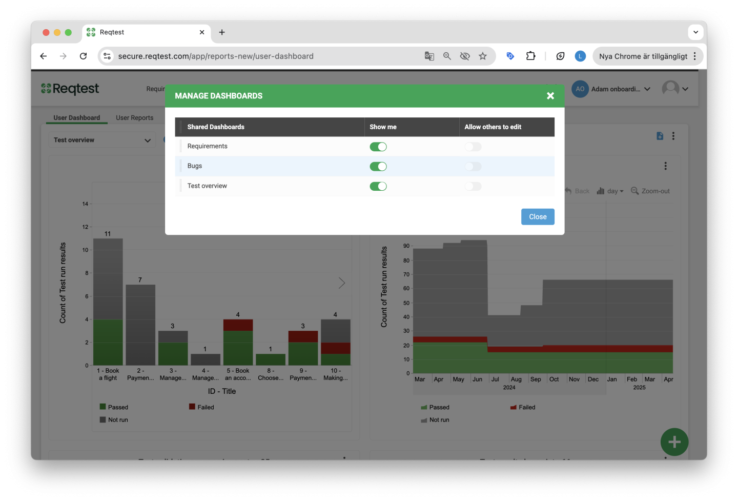
You can share your dashboards with other members of your projects and allow other project members to edit your dashboards. To manage your dashboards, click the Settings button next to the dropdown menu under the Dashboards tab in the Reports module.
Here you can:
-
See which dashboards are visible to you
-
Share your dashboards with others
-
Allow others to edit your shared dashboards
When you allow others to edit your shared dashboards, other members can rename the dashboard, duplicate it, and delete it.
Email notifications are sent to the owner of a shared dashboard if it is edited.
Set Dashboard as Default
You can set a specific dashboard as your default dashboard each time you enter the Reports module by clicking the Set as Default option in the kebab menu.
Organize Your Dashboard
You can customize the layout and the order of the reports on your dashboard by using the drag-and-drop function.
Quick Tip!
As an administrator, you can stop sharing dashboards created by others that are no longer in use. This is done under Manage Dashboards.


